
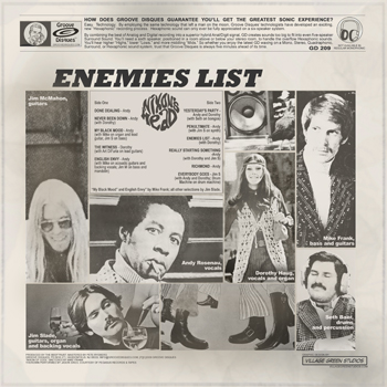
Recently I had the pleasure of being contracted to design the art for the latest release by Philly phaves, Nixon’s Head. The Enemies List (available for purchase here) cover was an exercise of almost pure creativity. Listening and then designing.
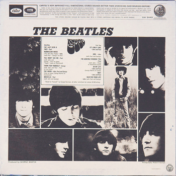
The back cover though was a joy for different reasons. The band wanted the back to be a take on the back of The Beatles Rubber Soul. (I derive an odd pleasure from finding/duplicating just the right font.)
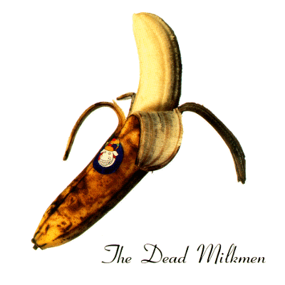
This got me thinking about album parodies and more specifically album backs. There are loads and loads of album parodies. Not the least of which include Townsman mrclean’s band, The Dead Milkmen’s Smokin’ Banana Peels cover:
I found at least one site devoted to cover parodies.
What I found a real dearth of though is album back images. I found this site, which has a pretty good library of CD art (front, back, inside…) Though it is far from complete and is not LP art. LP covers and CD covers are often the same but backs are not. As much as we bemoan the loss of LP covers, the back covers are truly almost completely gone. I have a coffee table book, Album Cover Album, and with a few exceptions it’s just covers.
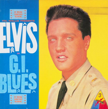
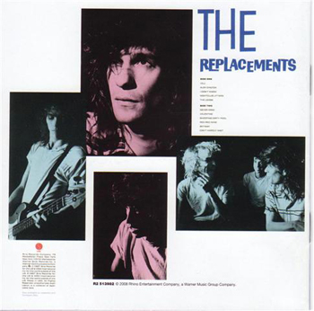
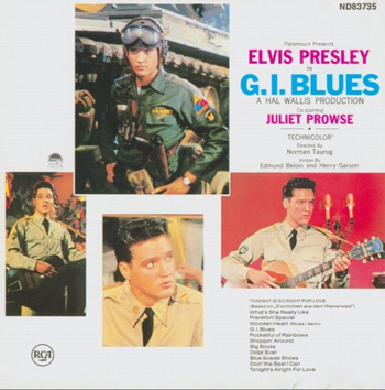
Having done one myself now, I wanted to share a couple of my favorite back cover odes. Most of us probably know that the cover to The Replacements Pleased to Meet Me is a take on Elvis Presley’s G.I. Blues:
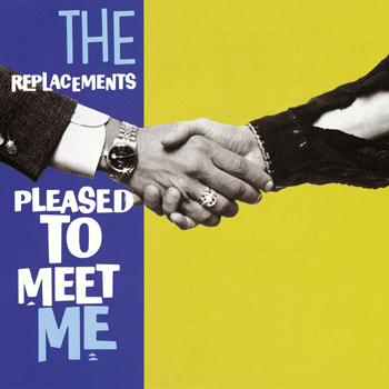
But did you know that the back was a take on the back as well?
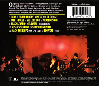
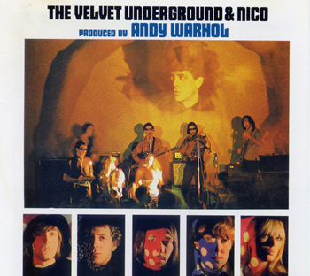
Or that the back of The Psychedelic Furs first LP was a take on the back of The Velvet Undergound’s first LP?
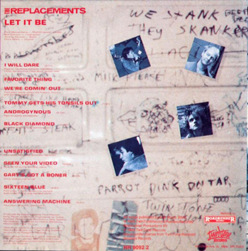
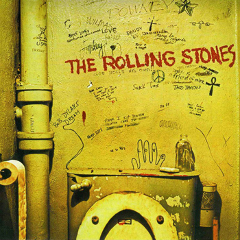
This one might be a stretch, but given that The Replacements Let It Be is a take on The Beatles not just in title but the band-on-a-roof image, I always thought the back was a take on the cover of The Rolling Stones‘ Beggars Banquet:
So in true RTH, geekier-than-thou, style let’s discuss album backs. I miss them.
What say you?

An obvious one: Sleater-Kinney’s Dig Me Out tips it’s hat to The Kink Kontroversy.
And I’ve always found this amusing: http://ecx.images-amazon.com/images/I/41VH7V170VL._SS500_.jpg
Sorry, I did not follow the purpose of this thread.
London Calling
more shameless self promotion. tsk tsk.
speaking of london calling, there’s also:
http://www.amiright.com/album-covers/images/album-Cyrus-Chestnut-Cyrus-Plays-Elvis.jpg
what about rod stewart’s body wishes
http://diskoduck.cz/shop/images/ROD%20BODY%20WISHES.jpg
and…
http://www.amiright.com/album-covers/images/album-Elvis-Presley-50000000-Elvis-Fans-Cant-Be-Wrong-Vol-2.jpg
people also think that the cover of “Get the Knack” is a “meet the Beatles” album cover tribute.
geekier than thou, art
the cover for 50000 Fall Fans Can’t Be Wrong is a blatant rip-off of Body Wishes
First off, great job on the back of the Nixon’s Head album, sammy.
I think the back cover of Utopia’s Deface The Music is a parody of the back cover of the Kinks’ VGPS.
Thanks disko. I never had VGPS on vinyl and the CD I have just has text on the back. And I’ve never owned any Utopia. So I’ll have to take your word for it. But you seem like a fairly upstanding gent.
cdm, given its title, i imagine that the fall cover is a ripoff of the elvis album (called 50,000,000 Elvis fans can’t be wrong), not the rod album.
on a related note, i remembered this one because JJ Jackson from MTV pointed out the rod album’s relation to the earlier elvis album back when i was a teen.
Here’s the back cover of VGPS (CD version):
http://www.kindakinks.net/discography/images/img00293.jpg
And here’s the back cover of Deface the Music:
http://tralfaz-archives.com/coverart/U/utopia_defaceb.jpg
Here’s another great parody:
http://tralfaz-archives.com/coverart/F/fgroovies_person.html
hmmm, you think?
Power popper Kenny Howes also has an album cover that’s a direct tribute to the second Beatles album, diskojoe. It’s a good album, to boot.
My favorite tribute is The Buzzcocks’ Singles Going Steady, which functions as a reverse tribute (ie, front switched with back) to The Beatles’ Let It Be
Great topic. I could look at album cover art tributes for hours. Meet the Residents/Meet the Beatles being a gimmie.
And how about the Beatles paying tribute to themselves with Introducing the Bealtes and the “Red” and “Blue” albums.
Mr. Mod, I never realized that the Singles Going Steady cover was a parody of Let It Be until just now.
The “Red” album cover was the original UK cover of the Beatles’ 1st album, while the “Blue” album cover was the proposed cover for the Get Back album, taken at the same place, a stairway at the EMI headquarters. They were going to parody themsleves.
The two amazing things about that Flamin’ Groovies live album besides that gincy cover:
1. That they were the opening act; &
2. They opened for Santana!
Finally, I listened to the Nixon’s Head CD last night, along w/new songs from Martin Newell which I downloaded from his site, The Beatles Second Album, the Loons, the Liverpool Five & the Ramones’ End of the Century. Quite heady company don’t you think?
if ‘singles going steady’ is a ‘let it be parody’ (and while i don’t think it’s a certainty, it might be), then it’s a piss poor one. it doesn’t contain enough of the first’s characteristics to get the parody over effectively.
maybe the band wanted a parody, but the graphic designer didn’t get it, or botched it, somehow.
the front of SGS doesn’t look anything like the back of LIB.
First of all, Sat, I learned this fact about Singles Going Steady in a Buzzcocks interview, so I’m not guessing or making it up. Second, it wasn’t intended as a “parody,” which connotes some mockery, no, but a reverse tribute, with the distant studio shot on the front rather than the back cover and the four frames of each band member on the back cover rather than the front – all framed in black. It was organized conceptually in tribute to Let It Be; Shelley or Diggle didn’t claim that the graphic designer took great pains to match fonts and themetic elements to the extent that some desigers, like that cat who did the Head album, did.
mod, i believe you about their intentions.
i picked up the word “parody” not from you, but diskojoe. but whether parody or tribute, it’s a shitty job, especially if we have to read about it to see it. i agree with you, though, that one doesn’t have to go to great pains to match fonts, etc., but in this case, the original is so plain and generic that it almost demands a higher level of mimicry in order to get the tribute across.
besides, there is no “distant studio shot” on either side of LIB.
the back cover of LIB looks like this:
http://www.jpgr.co.uk/pcs7096_b.jpg
shitty concept. shitty execution. great album.
mod, check this out:
http://www.amiright.com/album-covers/images/album_Halo-of-Flies-Singles-Going-Nowhere.jpg
and oh man…who could forget this one?
http://media.idahostatesman.com/smedia/2009/02/04/19/355-0205_Life_soul_asylum.standalone.prod_affiliate.36.JPG
I often wonder about how smelly that photo shoot must have been.
yeah…i realized when i posted the link that i’ve always avoided looking at the details of the clam dip too closely. it’s just so frigging gross.
if you’ve ever even spent one back stage stint in karl’s presence, or know people who have also come into his orbit, you know how funny this picture really is. he was one of those creepily quiet, mischievous, never serious, often crude, but definitely not dim guys with chewing tobacco circle on the left butt pocket of every pair of jeans he’s ever owned past age 13. somehow, all this makes him the perfect guy for that parody, and that album cover an even bigger joke. the other guys in the band must have been on the floor with laughter the day of the shoot. but if he hated it, he probably never let on…wouldn’t give them the satisfaction.
THAT, my friends, how to be a bassist within band dynamics, is what a bassist often has to put up with, and how to handle it.
Sat, please don’t try to drag my man diskojoe through the mud on this Let It Be/Singles Going Steady Issue. The two of us have spoken offlist, and we’re VERY cool with each other. Although he didn’t come right out and say it, I’m pretty sure he was thinking that you were way out of line in your attacks on me. I didn’t come right out and say it to him, but I think he sensed just how tough my skin could be.
That said, I’m sorry, it’s not the back cover that has the distant studio shot but the inside of the original gatefold release, which I have owned since I was a kid. Here’s a link to how cool my version of the album looks:
http://www.thepurplearmadillo.com/store/media/beatles-rare-let-it-be-a-lg.gif
I’m sure this will give you a better understanding of where I’m coming from. I mean, I’m pretty sure you know EXACTLY what I’m getting at. And don’t think I didn’t appreciate that Halo of Flies album cover! Thanks.
at long last, the mod responds to my observation that the singles going steady album cover is a piss poor example of homage, emulation, parody, or whatever, to Let it Be.
first, let me say: poor baby. is this always how it is when you lose?
i guess all that concern with “look” (especially the look of a certain bleach blonde, goatee’d relief pitchers) has had a deleterious effect on the thickness of your nancy skin, which i thought, by now, would enable you to distinguish between an attack on your person, and my pointing out an uninspired job by a second rate graphic designer working for a record label whose first rate designers were no doubt working overtime to get every last detail of “emotional rescue” to look right.
i know about the “distant studio shot’s” place of residence on the inside of the gatefold. do YOU know about the fact that its location there shoots your “reversal” theory all to shite?
i am duty bound by my RTH persona to acknowledge of your ability to read an interview, while also pointing out your astonishing inability to keep an eye on both covers while thinking critically about the tripe that the buzzcocks rolled out there regarding what they must have known was a patently unspectacular cover that would have loads of potential consumers thumbing right through to the next one, and loads of record store proprietors sending them back to distributors in boxes marked “cut out.”
look, man…i’m gruff and crusty. that’s my thing. that’s my THING that i DO. that ‘halo of flies’ cover was the best i could come up with as a healing moment. glad you liked it.
these exchanges are why i SO love rth.
in case you hadn’t noticed, berlin has given me my edge back.
i think i’ll do tons of smack, and make three overrated albums.
On the subject of CDs and lost back cover art, I kind of like the trend of CDs in those cardboard sleeves that allow for a little more flow in the art from front to back. Thom Yorke’s Eraser has that Stanley Donwood art that folds out and around. The Starlight Mints do similar kinds of things.
On the other hand, the cardboard sleeve CDs are sometimes harder to fit in CD case slots.
yeah, alex, i was just having a conversation with someone about the cardboard thing making cd’s a lot more consumable. jewel boxes blow.
and mod, before you go postal on me again, remember, i know the origins of this “off list” thing. I invented it. Don’t fuck with me man.