Are you exhausted and emotionally drained by the constant, vaguely conversational obligations you face on today’s social media platforms? Are you searching for a mindless, interaction-free way to sort-of-but-not-really connect with fellow middle-aged rock and roll fans with whom you share only the loosest bonds of electronic “friendship”? You’re in luck!
Today, we introduce a new feature here on Rock Town Hall, where we purposely sidestep all the deep, meaningful analysis and thoughtful commentary, and just go for the kind of lazy, internet-age, lowest-common-denominator commentary the world craves. In this feature, thoughtlessly titled “1 to 10,” we ask you, the reader, to simply assess the excellence of a rock artist, performance or artifact on a — yes, you’ve guessed — scale of 1 to 10. You are being asked for a number — a digit, a figure; and that is all. Having delivered your numerical verdict, you are then free to wander back to your electronic treetop to munch on fleas gathered off the backs of other internet residents you barely know. What could be easier?
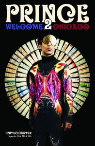
Today’s subject for “1 to 10” analysis: the poster created for Prince’s most recent concert series in Chicago earlier this year. A smaller image can be found at the top of this post; for a more detailed look, click here.
I for one think this is a “10,” but, as always, I look forward to your responses.
HVB


8
I’m confused about who is welcoming whom to Chicago. As it is, it looks like Prince is welcoming Chicagoans to Chicago.
I gave it a 4 on the strength of the colors and that circle of tickets or whatever it is. Is it Prince or Levar Burton’s character from Star Trek: Next Generation who is coming to Chicago?
As a design teacher, I give this a 2. It looks like a mash-up between Tron and the NBC Peacock.
My vote: 9. I know, I said it was a 10, but even Prince can’t be perfect. But I am surprised by the lack of enthusiasm for TACKAP’s duds. Those shades alone are worth six points!
4. Those sleep shades are for an overnight interstellar journey. I do like the choice of font, though.
I’ve never seen the acronym TACKAP before. C for currently?
I gave it a 6. I kind of like the psychedelic Tron suit, the tickets, and the Prince-required “2” in the title, but I’m not sold on the font unless it’s a Prince graphic reference I don’t know about.
I gave it a three, mostly because I like the Phil Manzanera knockokoff fly eye glasses. I’d think Prince could afford to get them somewhere other than Dollar General, though.
I probably could be worse but I can’t think of how so I gave it a 2.
Three. The main font is good, but I hate using a 2 for to. I mean, it also can be two or too. Far 2 confusing. Now that you say those are sunglasses, I believe you, but in isolation I figured they were eye protection for any mirrors that might happen to be in the area of the photo shoot. His shoulders are on fire and his ribcage is a kaleidoscope, but the lack of laser beams shooting out of his fingertips means he held back.
Nothing Compares 2 2
When Prince does his album of Standards he’ll be sure to cover “T 4 2.”
I feel it necessary to say that 26 responses to a question of this magnitude is unacceptable. Vote early, vote often. I’m letting this poll run on The Main Stage until we have at least 50 votes tallied. Thank you.
Come on, folks, to make this poll mean anything we need to direct our full attention on the score for Prince’s concert poster. I thank those of you who have not yet voted in advance.