
Mar 282010
Truth?
You can’t judge an album by its cover, but let’s face it: sometimes we do. Based on cover art alone, which album was most likely to suck?
- Lou Reed’s Ecstasy
- Lou Reed’s Sally Can’t Dance
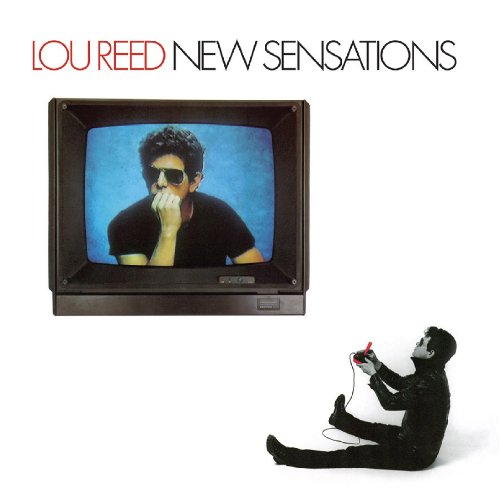
- Lou Reed’s Mistrial
- The Blasters’ debut
- Or something else?
When you finally heard that album with the lousy record cover, did it actually suck, was there truth in packaging?
What’s a rare example of an album with a lousy cover that far surpassed your unfair expectations?

To be fair, I think we need to rule out the influence of the artist’s name listed on the cover. For instance, Journey could have had Picasso design an album cover, but as soon as “Journey” was stamped across one of the upper corners all bets would be OFF!
Dylan’s Shot of Love has a pretty dreadful, faux pop-art cover. But I think it is a rather good record (and, in fact, much better than its reputation suggests; although it is one of his classic “leave off great songs and screw things up records” which is why the Bootleg Series was necessary, but I digress). His Planet Waves has a pretty bad cover, too, but is quite good.
Neil Young’s American Stars and Bars is awful (the cover) but is a good record. I always found the cover very off-putting.
I rate the Mats´ Tim even higher than Let It Be, but it´s cover is dreadful. So: no.
I like the American Stars and Bars Cover!
The cover for Thin Lizzy’s “Jailbreak” is pretty lame, but it’s pretty darn great.
http://www.backtoblackvinyl.com/images/album-artwork/big/thin-lizzy-jailbreak-front.jpg
Or it may be an amazing cover, if you appreciate the intersection of Rock and cheese.
Dude! That’s comic book art!
I know, I know, Neal Adams, blah, blah, blah. Jack Davis was an amazing illustrator, too, but that doesn’t mean he should’ve been making album covers, either.
Now, Don Martin — *there* was a guy who should’ve made a few rock album covers. Or Basil Wolverton.
Pretty much the entire output of the Butthole Surfers fits into this discussion. Judging them by their covers could go either way depending on how one feels about their musik.
Duane Eddy’s “Water Skiing” delivers on the sucktitude. How can anything good possibly come out of the concept? It even lists the song titles on the cover: “Deep-Water Start”, “Toe-Hold Side Slide”, “Rooster Tail”, “Jumping the Wake” and other water skiing inspired fare. And the music? Well, at least one song uses motorboat sound effects.
http://tinypic.com/view.php?pic=4q2byf&s=5
I’d say the Butthole Surfers covers are a pretty good representation of the music. Truth in advertising, indeed. Another good example of ugly artwork hpusing ugly music is the original Mothers of Invention Albums. Ugly but great.
Mistrial is a bad album cover. Ecstasy is scary bad!
Yes! I loves me some Lou Reed, but I don’t ever need to see him in “Ecstasy” ever again. Please excuse me while I go bleach that image from my brain.
‘Smell The Glove’ by Spinal Tap. Brilliant album, but the cover looked like death.