
UPDATED WITH FULL GATEFOLD IMAGE
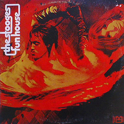
Next to the music itself on The Stooges’ Funhouse, the most influential thing about that album is the shot of the band sprawled out on that Afghan rug when you open the gatefold sleeve.
Full image after the fold.
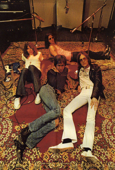
Oh – you only know the album from a single-sleeve vinyl reissue or CD reissue? Or you’ve only downloaded the tracks and have no album art whatsoever? You don’t know what image I’m talking about? My child, then you know only part of the greatness of Funhouse.
What band whose members owned the gatefold vinyl version has not sprawled out on the nearest Afghan rug? The band I’m in recorded its first EP in an old TSOP-related studio, which still had tube equipment with big black knobs. The coolest thing about this place, however, was the big Afghan rug in the middle of the floor. We spread out on that thing as soon as we got done with introductions to the engineer and he got on with the business of plugging in mic cables. The thought that we were tapping into the powers of the Funhouse rug went a long way toward making our first commerically available release. It provided a great deal of focus – and I’m pretty sure it helped our sound.
Surprisingly – or maybe not so surprisingly, in this age that has grown up without gatefold sleeve – an exhaustive, 5-minute Google search did not turn up a shot of that gatefold sleeve, but I did find the image on the following permutation of Funhouse:
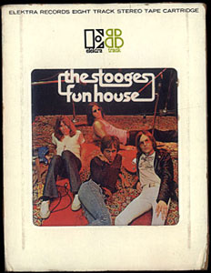
I have never heard this 8-track release of Funhouse, but even lacking the front cover graphics, I am confident that it’s better than any version of Funhouse lacking that image as part of the packaging.
Labels can cut corners with reissues, but there is a price to pay when the graphic impact of the original release is compromised. Along with gatefold releases cut back to single-sleeve releases, there are other repackagings that adversely affect the overall impact, including the sound, of an album. For instance, any original album with a textured sleeve, such as a ’70s Neil Young album or The Undertones‘ Positive Touch, that is repackaged with 2-dimensional graphics is inferior. Trust me, it even sounds worse. Any album that has been censored in reissue form, such as Roxy Music‘s Country Life, is adversely affected. Recently Townsman HVB, I believe, characterized Led Zeppelin III as a “failure.” Only one who owns a version of the album that eliminates the die-cut wheel would think such a thing!
Do your fellow Townspeople a favor: share with us your experiences with albums that were adversely affected by reduced graphics in reissue and/or digital release. Isn’t it time we hear music the way it was meant to be packaged?

By the 1980s, only the first pressings of LPs contained the once de rigeur custom paper inner sleeve. The only problem was, that was usually where handy things like the liner notes and the lyrics were! I own many, many albums from the ’80s that I had originally thought had been released with a nearly Factory Records-like sense of minimalism, but it turned out they were just second pressings that had been given the standard clear-plastic inner sleeve.
By the way, don’t think we didn’t notice you sticking “TSOP” and (boldfaced, yet!) big black knobs in the same sentence.
Mad props to The Back Office for supplying that image. We’ll take good care of it.
I don’t really care about graphics. I’m not a very visual person, and I don’t care much about an artist’s Look. And I no longer smoke weed, so gatefold albums have one less reason to exist.
What I do miss is the reading matter. Not just lyrics, but musician credits and technical stuff. How many times have I read “mastered by Greg Calbi” without knowing who that was or what it really meant? When CDs came in all that stuff got so small you could hardly read it, and now that I buy mostly downloads I don’t get access to that information at all. Artist websites sometimes have some of it, but it’s not like what used to be printed on album jackets and inserts.
Indeed, reduced graphics are yet another factor in reissues often not sounding as good as they did in their original packaging. On the other hand, sometimes the reissue has expanded liner notes, which usually improves on the initial release.
The CD-versions of the Hendrix albums were mixed-bags for presentation. All three had massively inferior “new” covers on them, with the “regular” album covers on the back of the CD booklet so you could flip them around. Original misunderstanding of what Hendrix wanted aside, I can’t see anybody being more drawn to the CD cover than the album version for Axis. On the plus side, I really liked the liner notes in those booklets. I like having something to read/thumb-through/look at when I’m listening to something the first few times.
On a more general note, the way CDs are presented and put into racks in most stores makes CD shopping/browsing a lot less interesting than doing the same was for albums. Instead of flipping through and looking at album covers, the way CDs are often crammed into racks makes it feel like you’re mostly browsing a sea of those white plastic name stickers on the top of the CD cases, which are both faceless and a pain in the ass to peel off if you do buy them. Whoever invented those should be brought in to face Rock Crime charges.
I’m with you on the overdue Rock Crimes charges, Alexmagic!
I hate that sticker! Finally a few things have started coming out with that sticker on top of the cellophane, which means that the jewel case isn’t sticking to the beautiful Digipack that it sits on the shelf next to. I hate that sticky stuff!