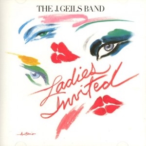
If the purpose of an album cover (“a whuuut?”, ask the kidz) is to illustrate, complement or merely represent the contents of the album itself, then there are a lot of bands who have, at some point or another, seriously dropped the ball — and it’s up to us to call them out on it!
This was brought to mind for me a few days ago, as I went looking for the J. Geils Band album that contained one of my fave JGB chunes, “The Lady Makes Demands.” It turned out it was contained on the 1973 album “Ladies Invited.” But you’d never have guessed by looking at the album cover! It’s like the band clambered into a time machine and magically transported themselves, along with their graphic designer, to the mid-80s for a sit-down with the packaging experts assisting Duran Duran or Robert Palmer. WTF? Various online music sites told me “Ladies Invited” sales were “disappointing.” No shit! It’s because nobody on Earth could have guessed that cover contained one hard-partyin’ album by Boston’s number one fun-time bar band!
Anyhow, my question to you is: what other album covers have been absolutely, completely, mysteriously WRONG like “Ladies Invited”?
I look forward to your responses.
HVB


I had NO idea that album cane out that early. I figured that wad a post-Freeze Frame release.. I’m still laughing from the time machine design process.
The Kinks starting from Everybody’s In Show-Biz. Although State Of Confusion and Give The People… are alright. Low points in that era are Schoolboys in Disgrace and Preservation. You could say the quality of music matches the terrible album covers.
I really like Nick Lowe and Dave Edmunds. I know that they are pub rock rather than punk/new-wave so they wouldn’t be copping either of those images. Still, I remember being bummed out at this cover and inside gatefold picture of Rockpile:
http://www.discogs.com/viewimages?release=1962286
Guys, can you try a little harder to potray coolness? The front looks like an advert for The Party Store, and the photo of them is just sorry in so many ways: Nick’s patch of grey hair and maybe open fly, Dave’s paunch and lame duck’s ass hair, is Billy being funny or Fonzie?, Terry forgot his belt.
Costello played up his nerdiness on purpose. Rockpile just seem to be nerds. Granted that they were older than their chart rivals, but I think they’d have been more popular if they’d tried harder on their image.
This, from Wikipedia, explains a lot:
The model for the cover artwork, illustrated by the noted fashion artist Antonio, was reportedly the actress Faye Dunaway,[2] who married lead singer Peter Wolf the following year.
Thanks for your observations, Cliffs and Chick. Anybody else have any good examples of cover art that really does a shitty job summarizing the style and intent of the album it contains? (Note that I’m not just looking for shitty cover art; I want cover art that actually misleads and/or confuses the viewer.)
HVB
I’ll go again in case my Kinks comment missed the point.
Steve Earle’s early albums pretty much represented the musical content within. Either country guy and his guitar on the albums Guitar Town and Train a Comin’ or the hard road on Exit 0 or Copperhead Road.
http://upload.wikimedia.org/wikipedia/en/0/01/Steve_Earle_-_Train_a_Comin%27_Coverart.jpg
But since 1996, he’s had artist Tony Fitzpatrick handle his album covers. The covert art featuring slate or mosaic designs are decent but don’t tell you what kind of music to expect.
http://upload.wikimedia.org/wikipedia/en/c/c8/Steve_Earle_Transcendental_Blues_Cover.jpg
http://upload.wikimedia.org/wikipedia/en/f/f3/Washington_Square_Serendae.jpg
http://upload.wikimedia.org/wikipedia/en/8/87/Steve_Earle_-_Jerusalem.jpg
After a while they all start to look the same.