
Jul 012013
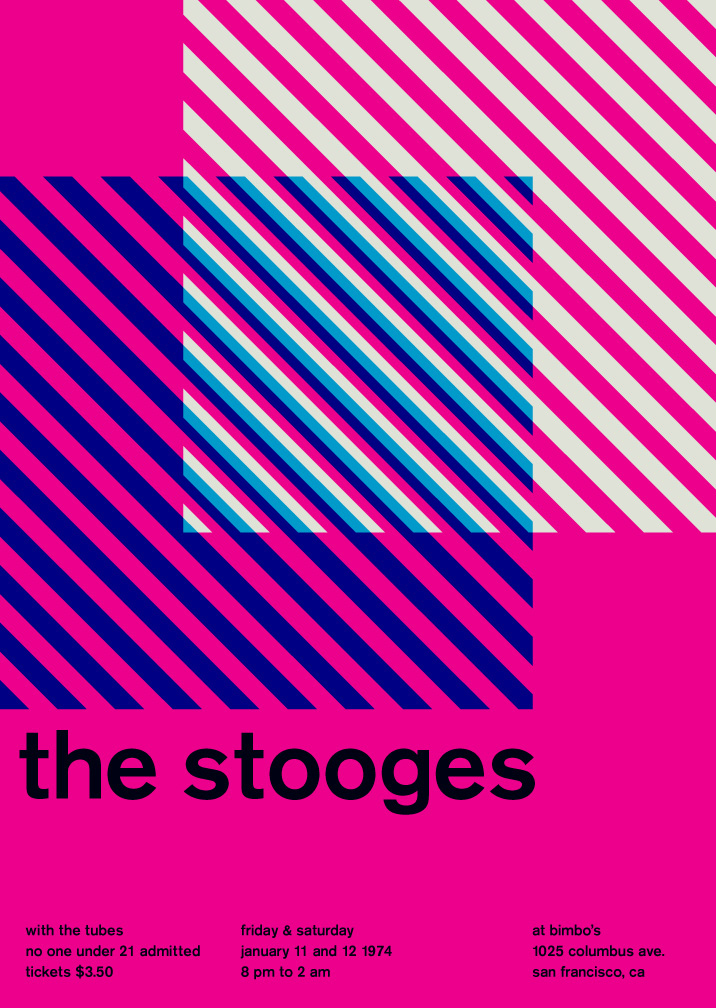
The work of graphic designer Mike Joyce is a marriage made in heaven: Typography and Punk. Joyce has transformed the d.i.y. flyers announcing punk and indie shows–the collaged, the Xeroxed, the disposable–and treated them to Swiss modernist style (anyone seen the documentary Helvetica?).
These posters, re-contextualized, visually engaging, and slightly humorous, are an homage to great gigs (see how many you’ve attended), and the formalized text and images that arose out of Switzerland in the ’50s that focused on cleanliness, order, objectivity, and readability.
See the work here at http://www.swissted.com
They’re all also available as an 11 x 14 book, with each page perforated so you can hang ’em on the wall.

These work for me on a visual/graphic design level: nice bold colors, clean typeface. I would hang them on my wall.
These do not work for me on a musical level. The images rarely provide any information about the band (exception: Black Flag), and the information about the other acts on the bill and the location/date of the show is minimal and not immediately evident.
And I sort of like a lot of DIY fliers: even though they can be scruffy, they share the pertinent information about the show, and if they reflect good design, all the better.
When we go to The Fillmore, I’m always checking out the show promo posters, trying to find that perfect marriage of design and information. Sometimes the randomness is infuriating and I scratch my head wondering WTF, but sometimes the images are witty and referential.
Funny that you should post just about what I was thinking, as I put together the little poll that I thought might spark some chatter.
I also like the style of those Swiss typography-driven posters, but after a while I feel like I’m looking at a shelf of 33 1/3 books or hip college textbooks.
The classic posters of the psychedelic age are hard to beat, but I am personally connected to the DIY Xeroxed posters every nobody-band with a member with a crappy office job would make and run off when the boss wasn’t looking. One year I worked in a solo office in City Hall, with almost nothing to do. I’d get high at lunchtime and spend hours cutting up the newspaper, making intricate collages that, at least to my stoned senses, were indebted to the likes of Max Ernst. At least my bandmates and I got a good laugh out of them. We’d tack them up on telephone polls prior to our gigs. It was exciting, and it was exciting to see similar works by our friends in other bands and the people who did that stuff for the various clubs around town.
I still miss making collages and Xeroxing them for that weird, bad quality that resulted from mid-’80s machines.
Mod, we reach! I wish I wish I wish I still had copies of the posters I slaved over during my college years. Our running gag was to include Bob Hope’s head in all our promotional stuff, and finding just the right way to insert Bob’s noggin into a collage or band action shot was always a hoot. My favorite was one of the simplest: a xerox of a page out of an old encyclopedia showing 10 or 20 oceanic fish species swimming under the waves in stratified harmony. Each fish was labeled by species: the grouper here, the sawfish there, a school of sardines swimming above. In the middle of the page, floating happily along with his pelagic brethren, was the disembodied head of Bob Hope. My proudest moment as graphic designer for Bob’s Revenge.
I like the Fillmore posters of old, but these days, the Fillmore continues to make and distribute free posters for sold out shows. We have quite a few now, the most recent being from Yo La Tengo’s recent show here in May. That poster shows a sky, with a hunk of earth floating in it. On the “planet” are woods and a log cabin. A ladder is running up the side of the planet, and a dark, shadowy figure is standing in front of the house. Yo La Tengo is prominently printed amongst the trees, and then the show info is printed on top of the planet. I could probably postulate what this has to do with the current album (Fade), but I’m guessing the connections are in the mind of the artist, a Jessica Deahl. I wonder how she (and others) get their poster design gigs?
I love all of these styles.
I like Bob Pollard’s take on the collage style graphics that he used as Guided By Voices album art.
I’d live to see some of those efforts made on behalf of Nixon’s Head and Bob’s Revenge.
I chose the “Early Rock and Roll Boxing Match Style” which I took to mean posters in the style of the Hatch Show Print shop in Nashville. I think the imperfections in the Hatch style are what makes it so appealing to me. That and the simplicity of the designs. Some examples:
http://store.countrymusichalloffame.com/products/Johnny-Cash-Show-Poster.html
http://store.countrymusichalloffame.com/products/Hank-Williams-Linocut.html
I have this Hatch non-music poster in my kitchen:
http://store.countrymusichalloffame.com/products/It%27s-Better-Pure-Coffee.html
I did see the Helvetica documentary by the way, and I thought was really good.
Punk DIY for the reasons HVB and Mod state. Wish there had been an archivist to save those just to see what bands renowned and unrenowned we shared bills with.
I’ve seen a couple of Philly-area sites with this stuff, chicken. I’ve seen a couple of old bills from Revival, City Gardens, et al where we appeared. Usually, however, the archival activities around those posters seem to be driven by veterans of the hardcore scene. Lots of Crucifucks and Circle of Shit posters. Lots of bills with the Electric Love Muffin opening for Husker Du. I know you want to find the bill for when we opened for Miracle Legion!
Some of the psychedelic ones are too hard to read. I like the punk stuff, but so much of it is just gone. I really like the stuff for the indie type shows these days. I like this one : http://farm4.staticflickr.com/3166/3077749715_6affef421e.jpg
I like this Dirtbombs one, too: http://portlandposterpole.com/a-jan09/dirtbombs-vondada.jpg
I’m pretty sure I still have a Bob’s Revenge flier someplace, probably for DC Space.
I bet I also still have a Mod Fun flier I printed when I was an offset pressman in NJ during the summer of 85, sandwiched in with some “Aw Shit, I forgot” pads we would do when we were trying to use up a weird ink color. Just a lot of RAF crap and blurry shots of band members I think. I specialized in blurry printing, so that was good.
I doubt I have archived any of fliers I had a hand in, but those would be few in number for a start.
Eh, more like 1984, but whatever.
I’m sensing an RTH Band Poster Exhibit in the near future. Start collecting. Make sure Tvox knows about this. I’m pretty sure he’s a major archivist – the kind of guy who’s got set lists and god knows what else!
I love Art Chantry’s work: http://typeamericana.svcseattle.com/?p=978
http://www.artchantry.com/
For a year I taught visual communications at Temple U as an adjunct. My first assignment to the kids — who had no design chops — was to make a DIY punk poster of themselves. I started by showing a bunch of punk posters and explained that you didn’t need any skills to make these — and that was the beauty of them.
Of course the kids totally didn’t get it. Posters would come back with lines like “I like fashion” with a fashion model. Ok, I tried.