Our recent Last Man Standing on Tastefully Nude Album Covers (at least initially) resulted in less entries than I expected. Expecting one of those long, endless LMS competitions, I prepared, in advance, this palette-cleansing LMS, which I expect will result in a tight, fierce competition, with no more than a handful of entries. Here’s the challenge:
Have you ever browsed through a used records bin and been confronted with a band or album you’ve seen repeatedly yet never heard? As a music obsessive, I usually think to myself, I need to hear this someday.
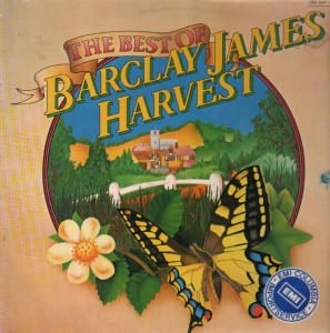
Occasionally, however, despite it being the 832nd time I’ve flipped to a particular band or album, I think to myself, I don’t believe I’ve ever heard this band/album before, yet frankly, I don’t feel a reason to ever hear it.
Anything, for instance, by Barclay James Harvest, brings this thought to mind.
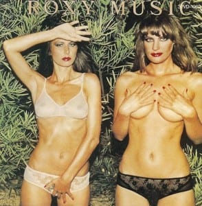
I cracked open the gatefold sleeve of my recent purchase of Eric Burdon & War‘s Black Man’s Burdon and was greeted by this NSFW image. I was quickly reminded of a dozen other album covers featuring tasteful (and no-so-tasteful) nude shots, the most obvious being Roxy Music‘s Country Life.* With those 2 entries now out of the way, my guess is that there will easily be another 98 tastefully nude album covers for Rock Town Hall participants to identify, maybe 198 more. Front cover, back cover, and gatefold spread count. Inside record sleeves/CD booklets do not.
What do you say? Feel free to include a link to your entry, and as always, please discipline yourself to one entry per post (although your number of posts is unlimited). Go!
*Regarding the definition of “nudity” for purposes of this thread, although the models on the cover of Country Life are partially clothed and attempt to tastefully covering themselves, enough nipple and pubic hair are left visible to qualify. For purposes of this discussion, a cover showing nothing more than cleavage, side- or under-boob, butt cheeks with thong, or the clothed outline of an erect penis will NOT be considered. On the other hand, fully unclad (head to toe) cover models who tastefully keep their privates private qualify. However, simply tastefully topless (with naughty bits covered) shots will be open to debate.
Digital music. Streaming services. All that newfangled jazz. I keep a toe in the digital waters. There are benefits to the medium, but I don’t think I’ll ever be swayed by the new technologies, like my man Andyr. I still like to touch my music, or at least the packaging of it. Until we come up with a better delivery device than the 12-inch vinyl album (and it’s kid brother, the 7-inch single, as well as its distant cousin from England, the 10-inch EP), I’m keeping the faith.
The other day my close, personal friend E. Pluribus Gergely and I were talking about records by favorite artists that lost us. “Did you buy Combat Rock when it came out?” he asked me.
You may recall this series that Mr. Moderator has run in the past. He posts an album cover and then says:
In 50 words or less, please describe how the album cover for Album Title, by Artist says all that there is to say, for better and for worse, about the music contained within.
It’s gotten to the point where I have trouble listening to new music; too often it’s a letdown. More often than that, the new release lives down to my expectations, expectations based primarily on the album cover art. I know that’s not right; I know I shouldn’t judge a book by its cover, but I do. As Paula Deen recently said, “I is what I is.” See if you don’t find yourself weeping in my strong embrace after you find yourself in the same boat with your reactions to the following relatively new releases. After the jump…
The work of graphic designer Mike Joyce is a marriage made in heaven: Typography and Punk. Joyce has transformed the d.i.y. flyers announcing punk and indie shows–the collaged, the Xeroxed, the disposable–and treated them to Swiss modernist style (anyone seen the documentary Helvetica?).
These posters, re-contextualized, visually engaging, and slightly humorous, are an homage to great gigs (see how many you’ve attended), and the formalized text and images that arose out of Switzerland in the ’50s that focused on cleanliness, order, objectivity, and readability.