
Jul 172012
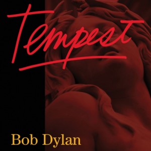
Details about Bob Dylan‘s upcoming album Tempest, his 35th, are trickling out, but for now let’s just talk about this: Is this his worst album cover? It’s a strong contender, mainly due to the red font, which looks like something from an ’80s direct-to-video sex thriller or Carly Simon album.
I’m not sure it’s as bad as these:
What do you think? And while we’re at it: What’s his best album cover, especially if you take the obvious ones from the ’60s out of the equation? I look forward to your responses.

The new one may be the worst, right up there with the latest Lindsey Buckingham album cover for Cheesiest Album Cover by a (at least somewhat) Major Artist Ever.
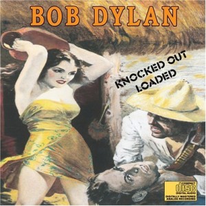
I’d never previously paid attention to Knocked Out Loaded’s cover. Looking at it now I kind of like it, in a perverse way.
Here’s the one I’d probably previously hated the most, Oh Mercy’s lame Hal Hartley movie scene-cum-graffiti art cover:
http://www.amiright.com/album-covers/images/album-Bob-Dylan-Oh-Mercy.jpg
I never considered it before but he really does have some lame ass album covers: Slow Train Coming, Planet Waves, Self Protrait. I don’t mind Knocked Out Loaded.
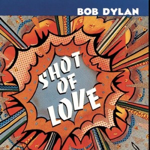
Yikes. Hard to say–Shot of Love is silly but kind of witty; Knocked Out Loaded is hard to separate from the ghastliness of the record itself. I’m ok with Oh Mercy, but, again, maybe because I love the record. Hard to beat the original Saved cover for awfulness: http://en.wikipedia.org/wiki/Saved_%28album%29 Not that the later one that supplanted it is any great bargain.
Also hard to top Empire Burlesque for garishness, of a particularly 80s kind: http://en.wikipedia.org/wiki/Empire_Burlesque In that respect, a very fair representation of the record.
Here’s hoping the music is better than the cover. It almost has to be, actually.
For best cover: if we’re taking out Nashville Skyline and Freewheelin’ Bob Dylan – the latter of which I think would be a part of a any “greatest album cover ever” debate – I guess I’d put Street Legal at the top. Then maybe Infidels, which isn’t a very exciting cover, but that’s a pretty damn good Look for ’83 Dylan.
I guess Time Out Of Mind probably would be fine, but it reminds me too much of (the following year’s) Costello/Bacharach Painted From Memory cover and makes both seem uninspired.
Is Empire Burlesque Dylan’s Dirty Work cover?
Runner-up to Time Out Of Mind in “album covers hurt by something that came out after the album cover”: Blonde on Blonde, which only makes me think of Doctor Who now.
Ooh, I forgot about Empire Burlesque. That’s terrible! Saved is bad, too, but it’s to be expected.
I don’t mind Oh Mercy either, maybe because it’s a good album. The cover maybe was trying too hard to be hip, but at least the color scheme and font choice weren’t completely eye-searingly awful.
Time Out of Mind looks a little too much like someone took a badly lit, out-of-focus photo and then Bob said “good enough!”
Knocked Out Loaded looks okay, I guess, in a pulp-novel kind of way, but it also reminds me of those booklets Christians hand out in train stations, little comic books where fornicatin’ drug abusers burn in eternal hell for their sins.
Putting aside the ’60s albums, I might say World Gone Wrong is the best cover.
I think it’s interesting that artists past a certain age are seriously discouraged from putting their faces on their album covers, leading to covers like this: http://www.createssomethingnew.com/wp-content/uploads/2010/03/randy_newman_songbook_vol1.jpg
Apparently Newman was told that his previous album Bad Love, his best in a long time, would have sold a lot better if it hadn’t had this scary cover: http://images.uulyrics.com/cover/r/randy-newman/album-bad-love.jpg
He’s got a lot of terrible ones. Freewheelin may be the ONLY good one he’s got.
Yeah, I took one look at that ghastly bit on iTunes this morning and thought “What the hell?” Dylan has never had album covers that compel me in any way. As a graphic design teacher, I like to quote my own teacher Milton Glaser (who created the original iconographic Dylan silhouette with the colorful hair poster) that design should “inform + delight”. Thankfully Dylan’s music does that, but who’d want to satisfy their curiosity or investigate his work based on such…the word “turds” comes to mind.
Maybe sometime I’ll start a thread on “How can you be such a good musician, and your covers consistently suck? Where’s the disconnect?” bands. (Sonic Youth, you’re next).
Ugh. All he needs is a Patrick Nagel illustration to make it complete. Where’d he steal that font from? A Robert Palmer album?
I had the same reaction to the Buckingham cover last year — just horrible.
http://www.amazon.com/Seeds-We-Sow-Lindsey-Buckingham/dp/B005DTERHA
Maybe you’ve seen this already, but it ties in nicely to a couple of recent threads:
http://www.mymodernmet.com/profiles/blogs/bob-egan-popspots
Yes, I have seen that–extremely cool work.
It looks like it a friggin’ perfume ad.
As bad as “Planet Waves” is — this “Tempest” might be the worst cover — it’s just really lazy — sort of like his live performances these days. Never again.
I agree with alexmagic. “Street Legal” is pretty cool.
Blonde on Blonde, which only makes me think of Doctor Who now.
HA!
Milton Glaser, huh? I have the original Rolling Stone Record Guide on a nearby shelf and Dave Marsh’s review calls that rainbow-hair poster, “really horrible … a psychedelic relic”. I always liked it; I had it on my wall (back when I put rock star posters on the wall).
I really dislike that Knocked Out Loaded cover.
Cool! (Not ironic cool, just cool)
I love the Street Legal cover, too. The caption should read, “Now, where did I park my car again?”
Empire Burlesque is precisely Dylan’s Dirty Work.
But forgive my ignorance but I don’t get the Doctor Who thing. But I’ve never seen Doctor Who. Can you explain?
http://totallylookslike.icanhascheezburger.com/2008/11/22/bob-dylan-totally-looks-like-the-fourth-doctor/
Is anyone seriously going to buy or not buy this album because of the cover?
My nine year old saw the album cover as I was reading this post and said “I’ve heard his name before.” I said “Yes, he’s a well known musician. He’s been recording for about fifty years.” She then proceeds to do the slow clap. I asked her why she was being sarcastic and she said, “He should be retired!”
It should also be noted that two days ago at the grocery store she asked me if we should get black balloons for my birthday.
Sure, I can imagine people shying away from this album based on its generic pharmacy checkout line Look. But not you. You are the man who brought us Listen, But Don’t Look, or whatever that great Glossary term is.
The future of the Hall looks bright.
Yeah, seriously. That’s hilarious stuff, bostonhistorian.
“Love and Theft” always looked like a slap-dash cover to me. Bland photo with some blah typography. I always think those sorts of covers are lazy. New one is bad too.
I see! Still, a great cover. But I’ll take Highway 61 or Freewheelin.’
I’m sure bob has stopped caring what the cover looks like by now. I dont pay any attention to them much anymore either, since I am all ipod for music (I buy the CD when I can but it goes right into iTunes and the CD+cover go right to my storage room in the basement never to be seen again.
A cool cover can help somebody get excited about a new release, for iTunes the name and title have to be huge to show up on the postage stamp space they offer.
CBS/Columbia/Sony has in-house designers, so maybe they are cutting costs and farming this out to the high school InDesign club or to interns.
If the music is good then who cares? If the music is bad a cool cover will not help much anyway.
Aw. c’mom! Bringing It All Back Home, Highway 61 Revisited, Blonde On Blonde, Blood On The Tracks…they’re all iconic.
I just find it comical when people go on about fonts as if they could be inherently evil.
Al, you are correct that they are all iconic, but I don’t find them visually interesting. “The Freewheeling..” is a very evocative photo. “Bringing it all..” looks like an outtake from The Most Intersting Man in World. “61” nothing going on there. “Blond” seems like a blurry take on Rubber Soul. “Blood” is OK. The cover isn’t that important, but for a guy with some interest in the visual arts (painting), I find his cover approvals to be odd.
Seems like you are saying “iconic yet boring”. Sounds like one of those wine descriptions. I can’t understand those either.
I’m halfway tempted to buy the CD and have her do a track-by-track analysis.
You know it just occurred to me that The Tempest is Shakespeare’s last play, and it’s usually interpreted as his farewell to the theater (see Prospero’s speech at the end). Is Bob trying to tell us that this is it?
That’s a chilling thought.